Card
Set up
Import Card in the script tag.
<script>
  import { Card } from "flowbite-svelte";
</script>
Default card
Use the following simple card component with a title and description.
Notice the href prop set, as that card is one big <a/> element.
<Card href="/cards">
  <h5 class="mb-2 text-2xl font-bold tracking-tight text-gray-900 dark:text-white">Noteworthy technology acquisitions 2021</h5>
  <p class="font-normal text-gray-700 dark:text-gray-400 leading-tight">
    Here are the biggest enterprise technology acquisitions of 2021 so far, in reverse chronological order.
  </p>
</Card>
Card with action button
Use the following example of a card element if you also want to have an action button.
Noteworthy technology acquisitions 2021
Here are the biggest enterprise technology acquisitions of 2021 so far, in reverse chronological order.
<Card>
  <h5 class="mb-2 text-2xl font-bold tracking-tight text-gray-900 dark:text-white">Noteworthy technology acquisitions 2021</h5>
  <p class="mb-3 font-normal text-gray-700 dark:text-gray-400 leading-tight">
    Here are the biggest enterprise technology acquisitions of 2021 so far, in reverse chronological order.
  </p>
  <Button>
    Read more <ArrowRight class="w-5 h-5 ml-2"/>
  </Button>
</Card>
Card with image
User reverse=true to reverse the position of an image.
You can use the following example of a card element with an image for blog posts, user cards, and many more.
Noteworthy technology acquisitions 2021
Here are the biggest enterprise technology acquisitions of 2021 so far, in reverse chronological order.
<Card img="/images/image-1.jpeg" reverse={true}>
  <h5 class="mb-2 text-2xl font-bold tracking-tight text-gray-900 dark:text-white">Noteworthy technology acquisitions 2021</h5>
  <p class="mb-3 font-normal text-gray-700 dark:text-gray-400 leading-tight">
    Here are the biggest enterprise technology acquisitions of 2021 so far, in reverse chronological order.
  </p>
  <Button>
    Read more <ArrowRight class="w-5 h-5 ml-2"/>
  </Button>
</Card>
Horizontal card
If you want to spice up your cards you can use the following card which has its child elements aligned horizontally.
<Card img="/images/image-1.jpeg" href="/" horizontal reverse={true}>
  <h5 class="mb-2 text-2xl font-bold tracking-tight text-gray-900 dark:text-white">Noteworthy technology acquisitions 2021</h5>
  <p class="mb-3 font-normal text-gray-700 dark:text-gray-400 leading-tight">
    Here are the biggest enterprise technology acquisitions of 2021 so far, in reverse chronological order.
  </p>
</Card>
User profile card
Use this user profile card example if you want to show a dropdown menu and buttons to enable multiple actions from your user.
- Edit
- Export data
- Delete

Bonnie Green
Visual DesignerCard with form inputs
Use this card example where you can add form input elements that can be used for authentication actions or any other context where you need to receive information from your users.
<SignInCard rememberMe signup={{name: 'Create account', href:'/'}} lostPassword={{name: 'Lost password', href:"/"}}/>Call to action card
Use this CTA card example to encourage your users to visit a certain page such as downloading the iOS or Android application for your project.
Work fast from anywhere
Stay up to date and move work forward with Flowbite on iOS & Android. Download the app today.
<Card class="!max-w-2xl text-center" padding='xl'>
  <h5 class="mb-2 text-3xl font-bold text-gray-900 dark:text-white">Work fast from anywhere</h5>
  <p class="mb-5 text-base text-gray-500 sm:text-lg dark:text-gray-400">
    Stay up to date and move work forward with Flowbite on iOS & Android. Download the app today.
  </p>
  <div class="justify-center items-center space-y-4 sm:flex sm:space-y-0 sm:space-x-4">
    <Button>Download it</Button>
    <Button>Get it on</Button>
  </div>
</Card>
Card with list
Use this card example if you want to show a list of data:
Latest Customers
View all Neil Simsemail@windster.com$320
 Bonnie Greenemail@windster.com$3467
-
Michael Goughemail@windster.com$67
<script>
  let list = [
    { img: { src: "/images/profile-picture-1.webp", alt: "Neil Sims",},
      name: "Neil Sims", email: "email@windster.com", value: "$320"
    },
    { img: { src: "/images/profile-picture-2.webp", alt: "Bonnie Green" },
      name: "Bonnie Green", email: "email@windster.com", value: "$3467"
    },
    { img: { src: "/images/profile-picture-3.webp", alt: "Michael Gough" },
      name: "Michael Gough", email: "email@windster.com", value: "$67"
    },
  ];
</script>

<Card padding="xl">
  <div class="flex justify-between items-center mb-4">
      <h5 class="text-xl font-bold leading-none text-gray-900 dark:text-white">
        Latest Customers
      </h5>
      <a href="#" class="text-sm font-medium text-blue-600 hover:underline dark:text-blue-500">
          View all
      </a>
  </div>
  <List items={list} let:item class="border-0 dark:!bg-transparent">
    <div class="flex items-center space-x-4">
      <Avatar src={item.img.src} alt={item.img.alt}/>
      <div class="flex-1 space-y-1 font-medium dark:text-white">
        <div>{item.name}</div>
        <div class="text-sm text-gray-500 dark:text-gray-400">{item.email}</div>
      </div>
      <div class="inline-flex items-center text-xl font-semibold text-gray-900 dark:text-white">
          {item.value}
      </div>
    </div>
  </List>
</Card>
E-commerce card
Use this card for your e-commerce websites and show information about the products and enable actions such as adding a review and adding the product to the cart.
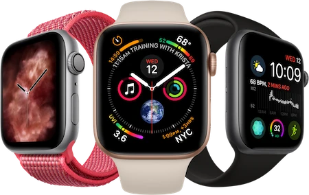
Apple Watch Series 7 GPS, Aluminium Case, Starlight Sport
Lorem ipsum dolor sit, amet consectetur adipisicing elit.
<EcommerceCard
  title="Apple Watch Series 7 GPS, Aluminium Case, Starlight Sport"
  href="/"
  price="$543"
  img={img1}
  stars={star5}
  btnText="Buy now"
>
<p cloass="dark:text-white">Lorem ipsum dolor sit, amet consectetur adipisicing elit.</p>
</EcommerceCard>
Props
The component has the following props, type, and default values. See types page for type information.
| Name | Type | Default |
|---|---|---|
| link | string | '' |
| rel | string | '' |
| alt | string | '' |
| img | string | '' |
| btnLabel | string | '' |
| btnColor | Colors | 'blue' |
| textdivClass | string | 'p-5' |
| headerClass | string | 'mb-2 text-2xl font-bold tracking-tight text-gray-900 dark:text-white' |
| header | string | '' |
| divClass | string | 'max-w-sm bg-white rounded-lg border border-gray-200 shadow-md dark:bg-gray-800 dark:border-gray-700' |